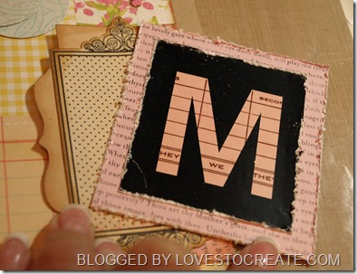
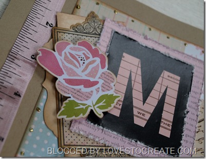
When creating one thing that you should consider is the packaging that your products come in. Here I wanted to share with you what I did with some packaging from the girls paperie. I first decided that the “M” would look great with the pink background piece of the ribbon packaging. I simply stuck the M on it and cut it out leaving some border around it. Then as I continued creating the shape of the packaging kept calling my name and I knew I had to use it somehow! Well, I simply turned it over and added some Tim Holtz Brushed Corduroy to age it up a bit. I then glued it to a journaling spot and then added the M piece to the opposite side and a fantastic new piece was easily created for my layout. So, think outside the box or better yet, use the box, LOL. The entire layout (except the green chip font) was created using items from the May Kit from “the girls loft” and if you haven’t purchased a kit from them I ask….what are you waiting for ;)


7 comments:
Oh, Nancy this is such a beautiful layout. Great use of DP, love the colors and how you put them together. Fantastic resycling, where fab done.
I totally love this one.You make me want to try to scrap something.
Wish you a great weekend.
*Gunn*
Great use of your packaging Nancy and fantastic layout,it looks great! Have a great weekend. Tracey x
That is so pretty...and your pics are gorgeous!
another great job and very creative way to reuse things.
What a beautiful layout!
Hi, Nancy! Terrific idea! Love how it looks with the Brushed Corduroy Distress Ink! :-)
I love your layout and how you used the packaging from your embellishment! I found you on Today's Creative today. I love your blog! Just signed up to follow you. Stop by & check out my scrapbooking blog when you get a chance. http://juliechats.blogspot.com
Post a Comment